Folders for School & District Admins
Optimizing EdTech Collaboration and Curriculum Management
TIMEFRAME
4 months
ROLE
UX Design and Research
TOOLS
Figma, FigJam
COLLABORATORS
Tracy Swander - Senior Product Designer
Kristen Thayer - Engineering Manager
Daniel Mrdjenovich - Product Manager
Sage Ono - Software Engineer
Danny Hendrix - Software Engineer
Tom Quinn - Software Engineer
Overview
Seesaw Learning, a prominent platform for student engagement and curriculum development in elementary schools, embarked on a project to enhance its user experience. The project's focus was to revamp the folders within the school and district library, making it more intuitive and efficient for administrators to curate and distribute recommended lessons to teachers. This initiative aligns with Seesaw Learning's mission to foster engaging, impactful learning experiences and its values of innovation, collaboration, and user-centric design.
Objective and Key Results
Create a more intuitive, effective system for school and district administrators to curate and disseminate lessons to teachers.
10% increase in teacher engagement in the school library
5% increase in platform usage for administrators
Process
EMPATHIZE
Understanding the user
Our design process was centered around our user personas - the administrators and teachers who are the primary users of our platform. We conducted comprehensive interviews and surveys to understand their needs, behaviors, and challenges. This understanding guided every decision we made during the project, from the initial brainstorming to the final development. We identified four main concerns:
Efficiently distributing and organizing lessons
Needing a customizable hub for teachers
Streamlined bulk actions for library organization
Varied permissions for folder access
They also want a controlled approval process to ensure quality. Addressing these issues will improve the platform's user experience and efficiency.
Documenting experiences
Personas offer a user-focused lens, helping us empathize with the specific needs and challenges of the District Administrator, School Administrator, and Teacher. By embodying their experiences, we ensure our solutions directly address their goals, resulting in a more user-friendly and effective platform.
What are other companies doing?
To gather valuable insights into expectations, design trends, and standards in the market, the team conducted a competitive analysis on similar small business websites.
Industry Best Practices
User-Friendly Interface
Curriculum Mapping
Departmental Collaboration
Flexible Course Offerings
Centralized Course Catalog
Filter and Search Functionality
Customization Options
Current User Flows
To delve deeper into the challenges faced by various personas, I analyzed the existing user flows. This analysis played a crucial role in guiding decisions throughout different phases of the project, ensuring alignment with engineering feasibility within the stipulated timeframe.
-
Add to Collection

-
Reorder and Add Section

IDEATE
Problem Area Map
Crafting problem area maps in collaboration with the Product Manager has been a crucial aspect of our case study. Together, we outlined three main issues, providing detailed descriptions, user-centric examples, potential solutions, and a priority ranking. These collaborative maps serve as a visual guide for decision-making, ensuring a cohesive and targeted approach to resolving user pain points effectively. The insights from both UX and product management perspectives contribute to a comprehensive understanding, allowing us to prioritize solutions that align with our shared goals and user needs.
Suggested User Flows
Informed by the problem area map and prior research, I formulated two user flows for the proposed solution. The MVP drew from the existing application, leveraging my insights as a developer on the product and a pragmatic assessment of what could be accomplished before the school resumed after winter break. The envisioned future state incorporated all requested features, featuring a subtle redesign and additional enhancements for the school and district library to elevate the overall user experience.
MVP
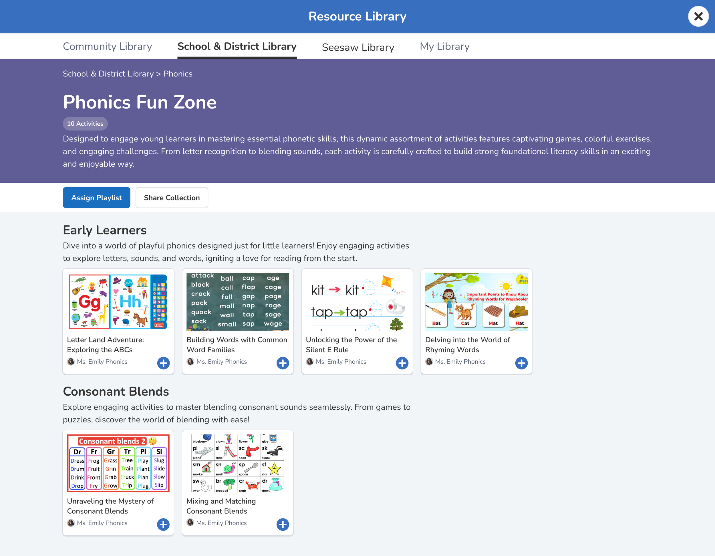
Adding the existing collection flow (from My Library) to Schools & Districts Library
Future State
Allowing Bulk Add, Approval, and Permissions
Wireframes
I created wireframes first to develop the overall structure of each page with the user flow in mind.
Exploring Design Options
Three design options for the “Create Collection” flow were presented to the developers during a UX/engineering working meeting based on level of effort perceived. The developers chose the most feasible option based on resources and complexity.
High Effort
The high effort design guides the user gently through creating a collection and adding activities before entering the page itself. They do all of this in one stepped modal design
Medium Effort
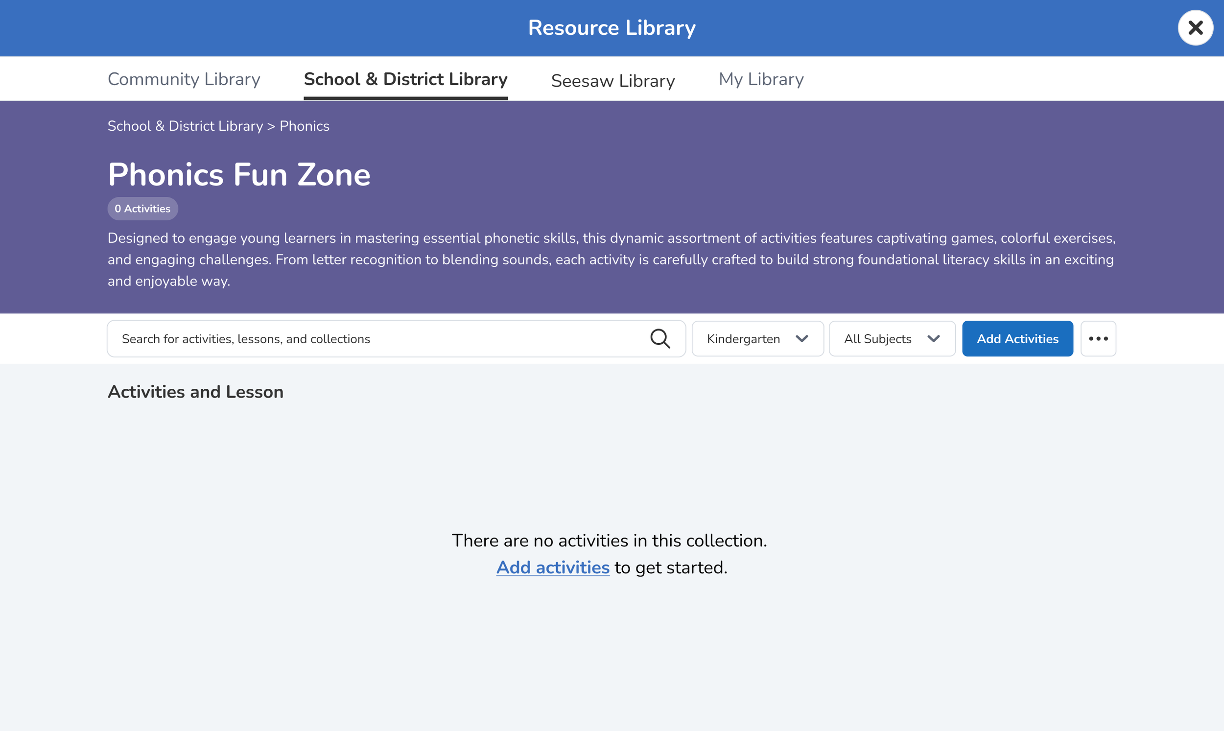
The medium effort designs do not walk the user through adding activities when they first create a collection. Instead they are taken to an empty page with a prompt to add them there. The modal from then on is the same any time they add more activities.
Low Effort
The low effort design uses the concepts Seesaw Learning has in the teacher profiles by just asking for a collection name and then letting the user change colors, descriptions, etc from there. They are similarly taken to a blank collection page where they are prompted to add activities.
PROTOTYPE
Visual Design
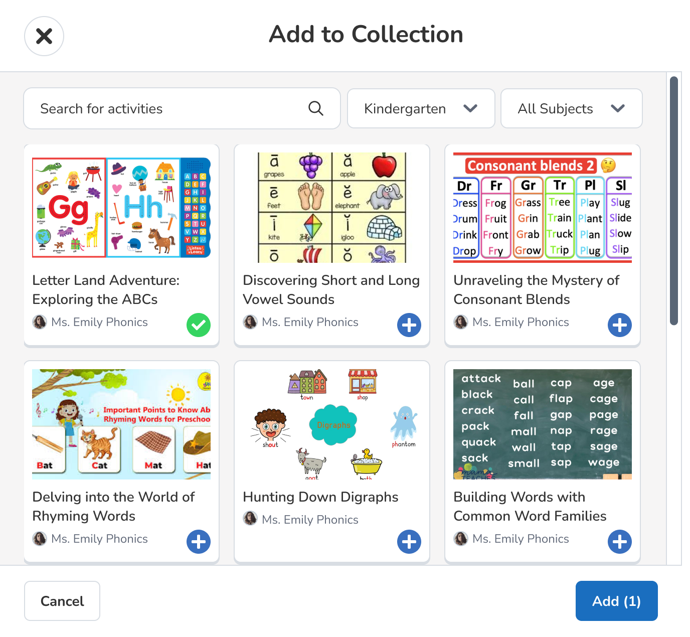
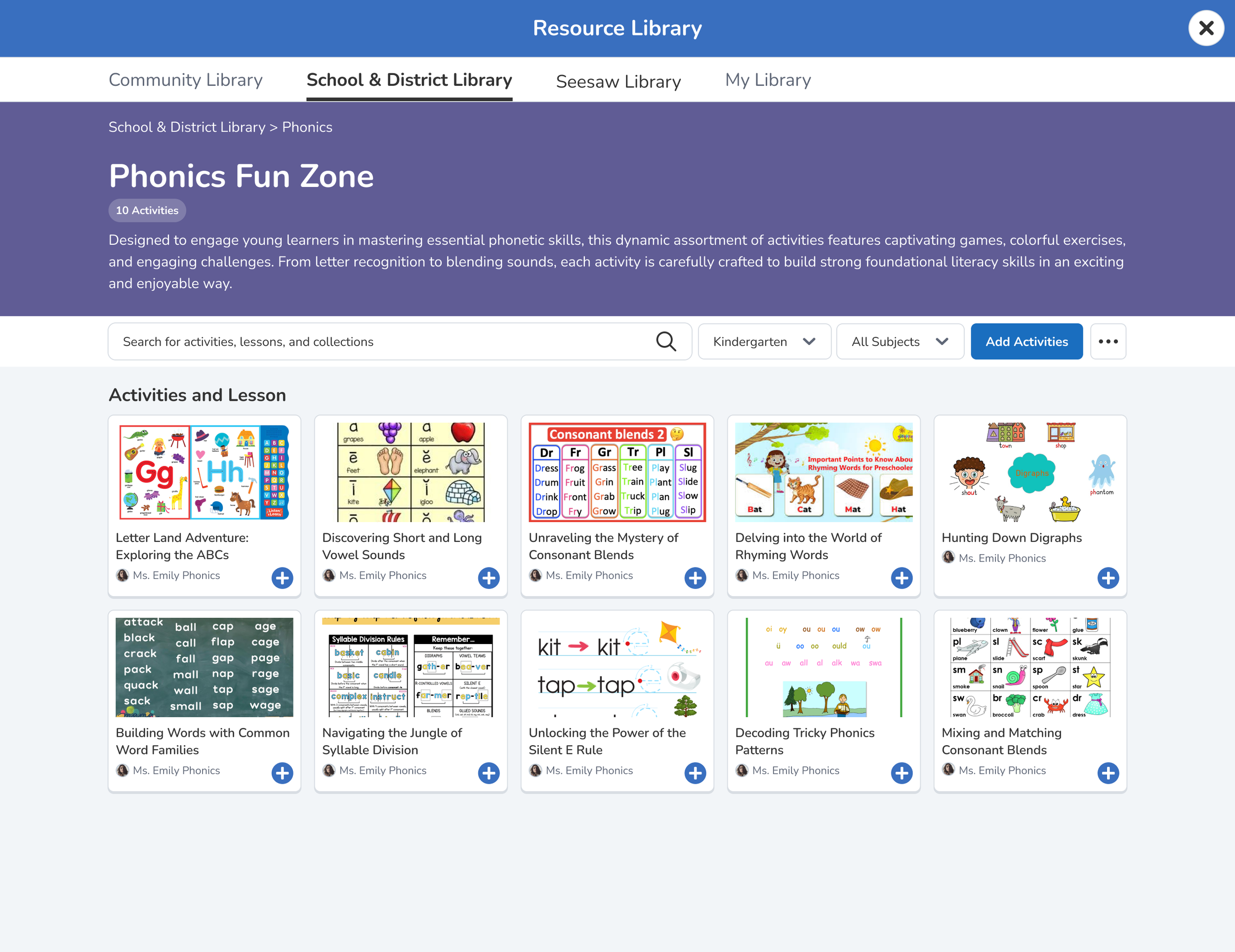
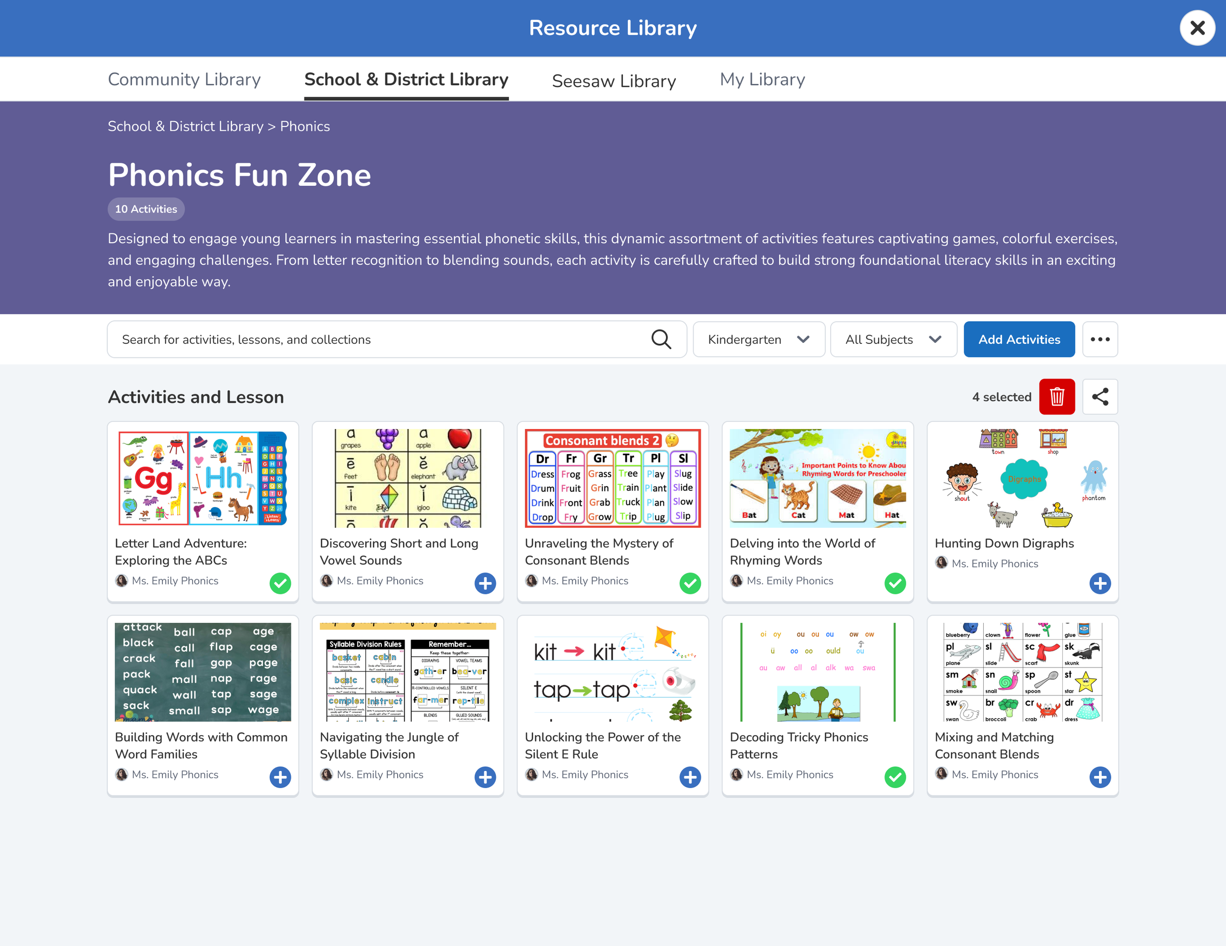
Now that all of the frameworks were in place, I worked on high-fidelity prototypes for guidance on later development and validation testing for the users before actual code-based work.
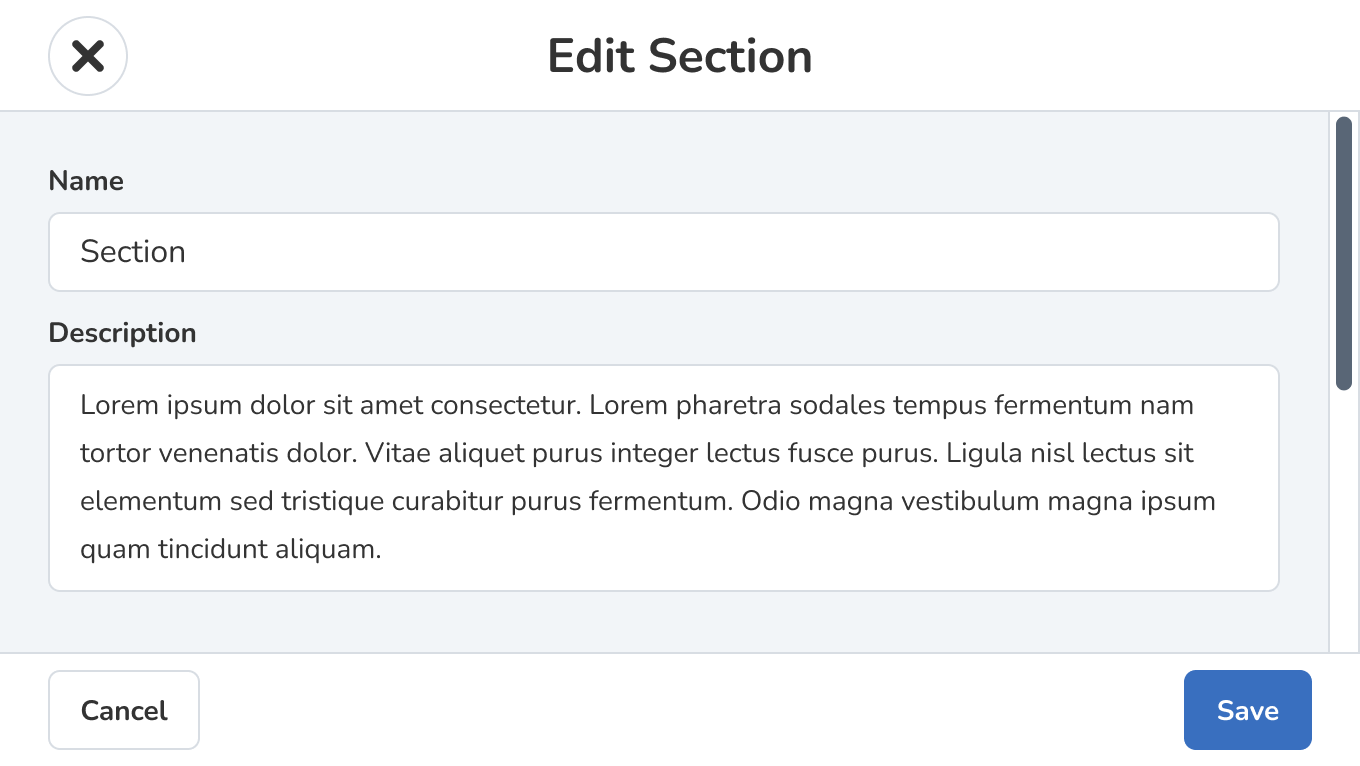
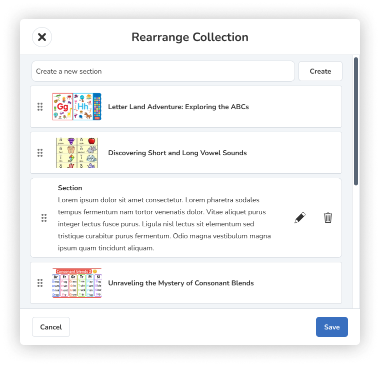
After the developers gave their anticipated constraints and available level of effort, I designed the rest of the functionality for the admins inside the collections such as:
Add/Edit Sections
Rearrange Collection
Delete Collection
Delete Activities
Edit Details

DEVELOP
Collaboration with Developers
Close Collaboration
Ensured alignment between design and technical feasibility
Leveraged Jira, GitHub, and Figma for a streamlined workflow
Valuable Insights
Developers highlighted potential challenges early
Compatibility Issues
Seamless Transition
Facilitated a smooth shift from design to development
Maintained practicality without compromising user experience
Adaptability and Innovation
Addressed unexpected obstacles swiftly.
Fostered an environment conducive to innovation and problem-solving.
Measuring Success
Post-launch data showed a significant increase in user engagement metrics, including a 15% rise in daily active users and a 50% increase in overall satisfaction with platform usability and organization. More importantly, our redesigned folders fostered diversity and inclusion by accommodating diverse learning styles and making the platform more accessible to all users.
15%
Increase in DAU
50%
Increase user satisfaction among admins
Learnings Recap
Throughout the project, I gained insights into the complexities of enhancing user experience within educational technology. Reflecting on challenges faced, such as balancing innovation with practicality, I deepened my understanding of designing for diverse user groups. These experiences have informed my approach to future projects, emphasizing the importance of collaboration and iterative prototyping.
Challenges
The journey was filled with challenges. We struggled with understanding the diverse needs of administrators and teachers, encountered technical limitations during the development phase, and faced hurdles in testing and validating our prototypes. However, these challenges only strengthened our determination. We tackled them directly, using innovative problem-solving techniques and fostering an environment that encourages open communication and collaboration.
Insights
One surprising insight from user research was the significant impact that intuitive organizational structures had on user satisfaction and engagement. While I anticipated the importance of usability, witnessing firsthand how streamlined navigation positively influenced user experience underscored the critical role of information architecture in product design.
Jordan was an integral part of the Content and Instruction team during her time at Seesaw.
Not only was she great at architecting and implementing features end to end, uncovering and fixing bugs quickly, and other engineering work, but she also leaned into her design skills and worked with the design team to propose and refine future design ideas for our part of the product. I'd love to work with her again in the future!
— Kristen Thayer
More Designs
Helping candidates find their job match one note at a time
Crafting a Unified Design System to Transform Mental Health Experiences with Intuitive and Engaging Interfaces
A strategic UX overhaul fostering engagement, empowerment, and aesthetic coherence in the realm of dance.


